Eben Ada
Designing a typeface inspired by Edo ancestral sceptres.
type design | exhibition
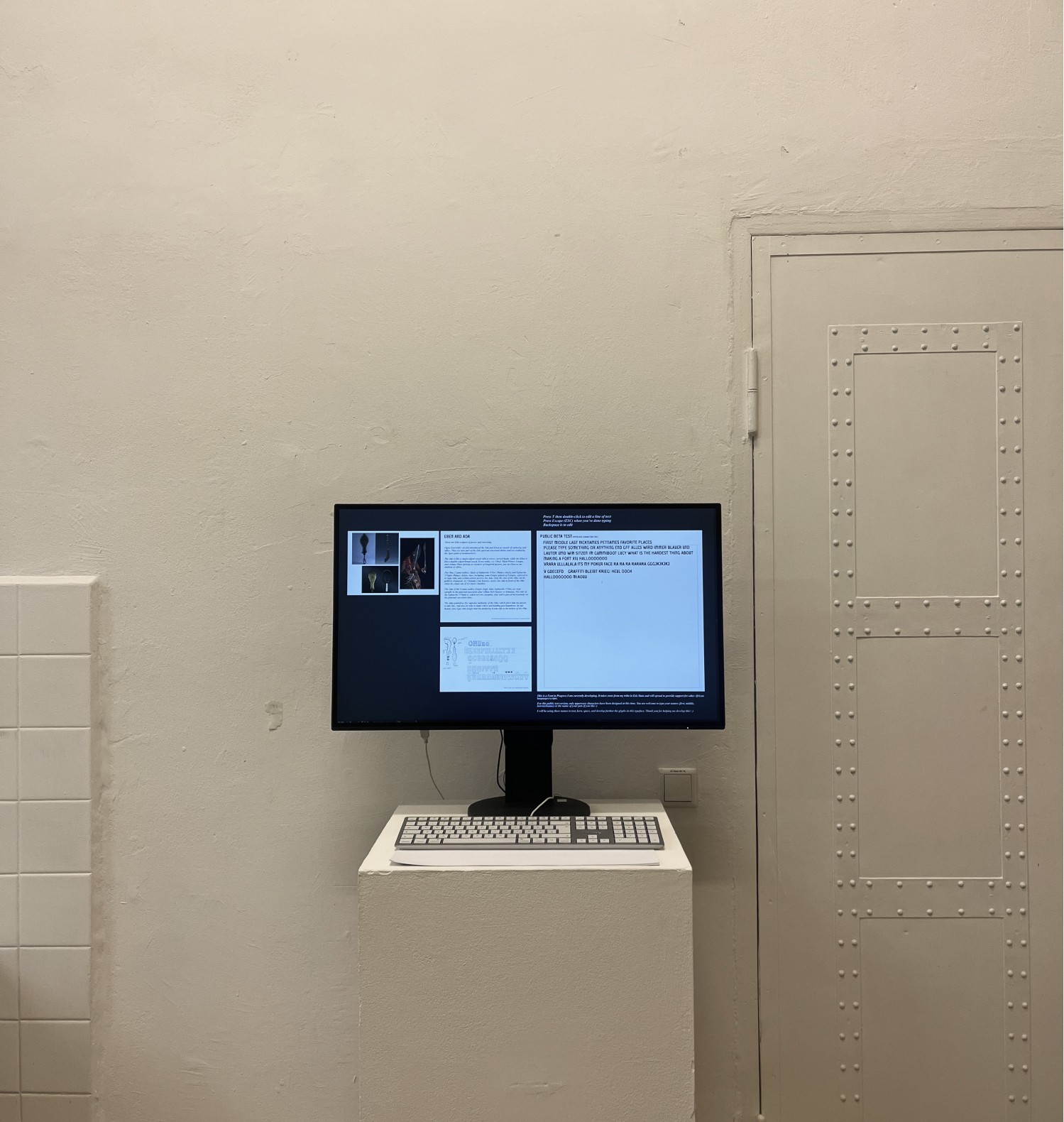
During my residency at the ASA winter program, it was a pleasure to exhibit a test version of a typeface I had been developing. It was open for public demo at the annual exhibition (Jahresausstellung) with Klasse Grafik at HFBK.
This font draws its inspiration/formal characteristics from cultural artefacts in my hometown. The Eben and Ada are Edo sceptres of power and rulership. The Ada is a single-edged sword with a convex curved blade, while the Eben is a double-edged broad sword. They are also part of the Edo paternal ancestral shrine and are crafted by the Igun guild of metalworkers.
The Challenge
I wanted to preserve and translate cultural & ancestral artefacts from my hometown into digital assets that could be functional to artists/designers. Choosing to work on this Type project was an opportunity for me to contribute to a growing library of open-source afro-centric digital assets.
The Solution
The formal characteristics of the sceptres informed the look, feel, and form of the characters for the font. By paying attention to its unique shapes and curvature, I was able to sketch out Latin scripts from Edo objects.
I am grateful for the wonderful conversations and feedback I got from people from various backgrounds who interfaced with my work at the public demo.